Working Examples are Not so Easy to Come By

Today’s installment in our Cooking with Python and KBpedia series is a great example of how impressive uses of Python can be matched with frustrations over how we get there and whether our hoped-for desires can be met. The case study we tackle in this installment is visualization of the large-scale KBpedia graph. With nearly 60,000 nodes and about a quarter of a million edge configurations, our KBpedia graph is hardly a toy example. Though there are certainly larger graphs out there, once we pass about 10,000 nodes we enter difficult territory for Python as a performant language. We’ll cover this topic and more in this installment.
Normally, what one might encounter online regarding graph visualization with Python begins with a simple example, which then goes on to discuss how to stage the input data and then make modifications to the visualization outputs. This approach does not work so well, however, when our use case scales up to the size of KBpedia. Initial toy examples do not provide good insight how the various Python visualization packages may operate at larger scales. So, while we can look at example visualizations and example code showing how to expose options, in the end whether we can get the package to perform requires us to install and test it. Since our review time is limited, and we have to in the end produce working code, we need a pretty efficient process of identifying, screening, and then selecting options.
Our desires for a visualization package thus begin with the ability to handle large graphs, including graph analytic components in addition to visualization, compatibility with our Jupyter Notebook interactive environment, ease-of-learning and -implementation, and hopefully attractive rendering of the final graph. From a graph visualization standpoint, some of our desires include:
- Attractive outputs
- Ability to handle a large graph with acceptable rendering speed
- Color coding of nodes by SuperType
- Varying node sizes depending on the importance (in-degree) of the node
- Control over the graphical elements of the display (edge and node styles)
- Perhaps some interactivity such as panning and zooming and tooltips when hovering over nodes, and
- A choice of a variety of graph layout options to gauge which best displays the graph.
Preferably, whatever packages work best for these criteria also have robust supporting capabilities within the Python data science ecosystem. To test these criteria, of course, it is first necessary to stage our graph in an input form that can be rendered by the visualization package. This staging of the graph data is thus where we obviously begin.
Data Preparation
Given the visualization criteria above, we know that we want to produce an input file for a directed graph that consists of individual rows for each ‘edge’ (connection between two nodes) consisting of a source node (subclass), a target node to which it points (the parent node), a SuperType for the parent node (and possibly its matching rendering color), and a size for the parent node as measured by its number of direct subclasses. This should give us a tabular graph definition file with rows corresponding to the individual edges (subclasses of each parent) by sometime like these columns:
RC1(source) RC2(target) No Subclasses(weight) SuperType ST color
Different visualization packages may want this information in slightly different order, but that may be readily accomplished by shifting the order of written output.
Another thing I wanted to do was to order the SuperTypes according to the order of the universal categories as shown by kko-demo.n3. This will tend to keep the color ordering more akin to the ordering of the universal categories (see further CWPK #8 for a description of these universal categories).
It is pretty straightforward to generate a listing of hex color values from an existing large-scale bokeh color palette, as we used in the last CWPK installment. First, we count the number of categories in our use case (72 for the STs). Second, we pick one of the large (256) bokeh palettes. We then generate a listing of 72 hex colors from the palette, which we can then relate to the ST categories:
from bokeh.palettes import Plasma256, linear_palette

linear_palette(Plasma256,72)
We reverse the order to go from lighter to darker, and then correlate the hex values to the SuperTypes listed in universal category order. Our resulting custom color dictionary then becomes:
cmap = {'Constituents'           : '#EFF821',
        'NaturalPhenomena'       : '#F2F126',
        'TimeTypes'              : '#F4EA26',
        'Times'                  : '#F6E525',
        'EventTypes'             : '#F8DF24',
        'SpaceTypes'             : '#F9D924',
        'Shapes'                 : '#FBD324',
        'Places'                 : '#FCCC25',
        'AreaRegion'             : '#FCC726',
        'LocationPlace'          : '#FDC128',
        'Forms'                  : '#FDBC2A',
        'Predications'           : '#FDB62D',
        'AttributeTypes'         : '#FDB030',
        'IntrinsicAttributes'    : '#FCAC32',
        'AdjunctualAttributes'   : '#FCA635',
        'ContextualAttributes'   : '#FBA238',
        'RelationTypes'          : '#FA9C3B',
        'DirectRelations'        : '#F8963F',
        'CopulativeRelations'    : '#F79241',
        'ActionTypes'            : '#F58D45',
        'MediativeRelations'     : '#F48947',
        'SituationTypes'         : '#F2844B',
        'RepresentationTypes'    : '#EF7E4E',
        'Denotatives'            : '#ED7B51',
        'Indexes'                : '#EB7654',
        'Associatives'           : '#E97257',
        'Manifestations'         : '#E66D5A',
        'NaturalMatter'          : '#E46A5D',
        'AtomsElements'          : '#E16560',
        'NaturalSubstances'      : '#DE6064',
        'Chemistry'              : '#DC5D66',
        'OrganicMatter'          : '#D8586A',
        'OrganicChemistry'       : '#D6556D',
        'BiologicalProcesses'    : '#D25070',
        'LivingThings'           : '#CF4B74',
        'Prokaryotes'            : '#CC4876',
        'Eukaryotes'             : '#C8447A',
        'ProtistsFungus'         : '#C5407D',
        'Plants'                 : '#C13C80',
        'Animals'                : '#BD3784',
        'Diseases'               : '#BA3487',
        'Agents'                 : '#B62F8B',
        'Persons'                : '#B22C8E',
        'Organizations'          : '#AE2791',
        'Geopolitical'           : '#A92395',
        'Symbolic'               : '#A51F97',
        'Information'            : '#A01B9B',
        'AVInfo'                 : '#9D189D',
        'AudioInfo'              : '#9713A0',
        'VisualInfo'             : '#9310A1',
        'WrittenInfo'            : '#8E0CA4',
        'StructuredInfo'         : '#8807A5',
        'Artifacts'              : '#8405A6',
        'FoodDrink'              : '#7E03A7',
        'Drugs'                  : '#7901A8',
        'Products'               : '#7300A8',
        'PrimarySectorProduct'   : '#6D00A8',
        'SecondarySectorProduct' : '#6800A7',
        'TertiarySectorService'  : '#6200A6',
        'Facilities'             : '#5E00A5',
        'Systems'                : '#5701A4',
        'ConceptualSystems'      : '#5101A2',
        'Concepts'               : '#4C02A1',
        'TopicsCategories'       : '#45039E',
        'LearningProcesses'      : '#40039C',
        'SocialSystems'          : '#3A049A',
        'Society'                : '#330497',
        'EconomicSystems'        : '#2D0494',
        'Methodeutic'            : '#250591',
        'InquiryMethods'         : '#1F058E',
        'KnowledgeDomains'       : '#15068A',
        'EmergentKnowledge'      : '#0C0786',
        }
We now have all of the input pieces to complete our graph dataset. Fortunately, we had already developed a routine in CWPK #49 for generating an output listing from our owlready2 representation of KBpedia. We begin by loading up our necessary packages for working with this information:
from cowpoke.__main__ import *
from cowpoke.config import *
from owlready2 import *
And we follow the same configuration setup approach that we have developed for prior extractions:
### KEY CONFIG SETTINGS (see build_deck in config.py) ###
# 'kb_src'        : 'standard'                                        # Set in master_deck
# 'loop_list'     : kko_order_dict.values(),                          # Note 1
# 'base'          : 'C:/1-PythonProjects/kbpedia/v300/build_ins/mappings/',
# 'ext'           : '.csv',
# 'out_file'      : 'C:/1-PythonProjects/kbpedia/v300/extractions/data/graph_specs.csv',

def graph_extractor(**extract_deck):
    print('Beginning graph structure extraction . . .')
    loop_list = extract_deck.get('loop_list')
    loop = extract_deck.get('loop')
    class_loop = extract_deck.get('class_loop')
    base = extract_deck.get('base')
    ext = extract_deck.get('ext')

    # Note 2
    parent_set = ['kko.SocialSystems','kko.Products','kko.Methodeutic','kko.Eukaryotes',
              'kko.ConceptualSystems','kko.AVInfo','kko.Systems','kko.Places',
              'kko.OrganicChemistry','kko.MediativeRelations','kko.LivingThings',
              'kko.Information','kko.CopulativeRelations','kko.Artifacts','kko.Agents',
              'kko.TimeTypes','kko.Symbolic','kko.SpaceTypes','kko.RepresentationTypes',
              'kko.RelationTypes','kko.OrganicMatter','kko.NaturalMatter',
              'kko.AttributeTypes','kko.Predications','kko.Manifestations',
              'kko.Constituents']

    if loop is not 'class_loop':
        print("Needs to be a 'class_loop'; returning program.")
        return
    header = ['target', 'source', 'weight', 'SuperType']
    out_file = extract_deck.get('out_file')
    cur_list = []
    with open(out_file, mode='w', encoding='utf8', newline='') as output:
        csv_out = csv.writer(output)
        csv_out.writerow(header)
        for value in loop_list:
            print('   . . . processing', value)
            s_set = []
            root = eval(value)
            s_set = root.descendants()
            frag = value.replace('kko.','')
            for s_item in s_set:
                child_set = list(s_item.subclasses())
                count = len(list(child_set))

# Note 3
                if value not in parent_set:
                    for child_item in child_set:
                        s_rc = str(s_item)
                        child = str(child_item)
                        new_pair = s_rc + child
                        new_pair = str(new_pair)
                        cur_list.append(new_pair)
                        s_rc = s_rc.replace('rc.','')
                        child = child.replace('rc.','')
                        row_out = (s_rc,child,count,frag)
                        csv_out.writerow(row_out)
                elif value in parent_set:
                    for child_item in child_set:
                        s_rc = str(s_item)
                        child = str(child_item)
                        new_pair = s_rc + child
                        new_pair = str(new_pair)
                        if new_pair not in cur_list:
                            cur_list.append(new_pair)
                            s_rc = s_rc.replace('rc.','')
                            child = child.replace('rc.','')
                            row_out = (s_rc,child,count,frag)
                            csv_out.writerow(row_out)
                        elif new_pair in cur_list:
                            continue
        output.close()
        print('Processing is complete . . .')
graph_extractor(**extract_deck)
This routine is pretty consistent with the prior version except for a few changes. First, the order of the STs in the input dictionary has changed (1), consistent with the order of the universal categories and with lower categories processed first. Since source-target pairs are only processed once, this ordering means duplicate assignments are always placed at their lowest point in the KBpedia hierarchy. Second, to help enforce this ordering, parental STs are separately noted (2) and then processed to skip source-target pairs that had been previously processed (3).
To see the output from this routine (without hex colors yet being assigned by ST), run:
import pandas as pd

df = pd.read_csv('C:/1-PythonProjects/kbpedia/v300/extractions/data/graph_specs.csv')

df
Evaluation of Large-scale Graph Visualization Options
In my prior work with large-scale graph visualizations, I have used Cytoscape and written about it (2008), as well as Gephi and written about it (2011). Though my most recent efforts have preferred Gephi, neither is written in Python and both are rather cumbersome to set up for a given visualization.
My interest here is either a pure Python option or one that has a ready Python wrapper. The Python visualization project, PyViz provides a great listing of the options available. Since some are less capable than others, I found Timothy Lin’s benchmark comparisons of network packages to be particularly valuable, and I have limited my evaluation to the packages he lists.
The first package is NetworkX, which is written solely in Python and is the granddaddy of network analysis packages in the language. We will use it as our starting baseline.
Lin also compares SNAP, NetworkKit, igraph, graph-tool, and Lightgraphs. I looked in detail at all of these packages except for Lightgraphs, which is written in Julia and has no Python wrapper.
Lin’s comparisons showed NetworkX to be, by far, the slowest and least performant of all of the packages tested. However, NetworkX has a rich ecosystem around it and much use and documentation. As such, it appears to be a proper baseline for the testing.
All of the remaining candidates implement their core algorithms in C or C++ for performance reasons, though Python wrappers are provided. Based on Lin’s benchmark results and visualization examples online, my initial preference was for graph-tool, followed possibly by NetworkKit. SNAP had only recently been updated by Stanford, and igraph initially appeared as more oriented to R than Python.
So, my plan was to first test NetworkX, and then try to implement one or more of the others if not satisfied.
First NetworkX Visualizations
With our data structure now in place for the entire KBpedia, it was time to attempt some visualizations using NetworkX. Though primarily an analysis package, NetworkX does support some graph visualizations, principally through graphViz or matplotlib. In this instance, we use the matplotlib option, using the spring layout.
Note in the routine below, which is fairly straightforward in nature, I inserted a print statement to separate out the initial graph construction step from graph rendering. The graph construction takes mere seconds, while rendering the graph took multiple hours.
import networkx as nx
import pandas as pd
import matplotlib.pyplot as plt

df = pd.read_csv('C:/1-PythonProjects/kbpedia/v300/extractions/data/graph_specs.csv')
Graphtype = nx.DiGraph()
G = nx.from_pandas_edgelist(df, edge_attr='weight', create_using=Graphtype)
print('Graph construction complete.')
pos = nx.spring_layout(G,scale=1)

nx.draw(G,pos, with_labels=True)
plt.show()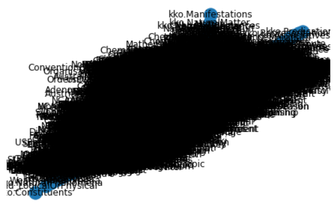
Since the labels render this uninterpretable, we tried the same approach without labels.
plt.figure(figsize=(8,6))
nx.draw(G,pos, with_labels=False)
plt.show() 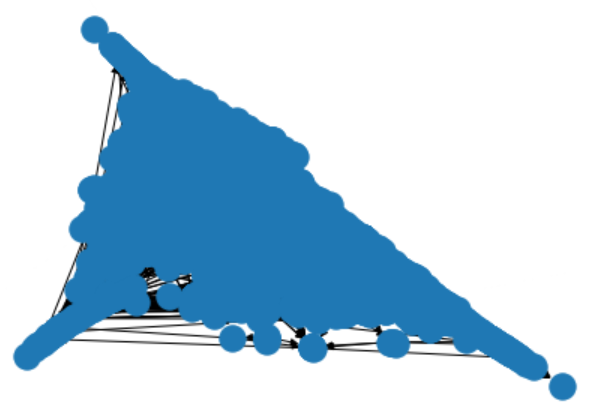
This view is hardly any better.
Given the lengthy times it took to generate these visualizations, I decided to return to our candidate list and try other packages.
More Diligence on NetworkX Alternatives
If you recall, my first preferred option was graph-tool because of its reported speed and its wide variety of graph algorithms and layouts. The problem with graph-tool, as with the other alternatives, is that a C++ compiler is required, along with other dependencies. After extensive research online, I was unable to find an example of a Windows instance that was able to install graph-tool and its dependencies successfully.
I turned next to NetworKit. Though visualization choices are limited in comparison to the other C++ alternatives, this package has clearly been designed for network analysis and has a strong basis in data science. This package does offer a Windows 10 installation path, but one that suggests adding a virtual Linux subsystem layer to Windows. Again, I deemed this to be more complexity than a single visualization component warranted.
With igraph, I went through the steps of attempting an install, but clearly was also missing dependencies and using it kept killing the kernel in Jupyter Notebook. Again, perhaps with more research and time, I could have gotten this package to work, but it seemed to impose too much effort for a Windows environment for the possible reward.
Lastly, given these difficulties, and the fact that SNAP had been under less active development in recent years, I chose not to pursue this option further.
In the end, I think with some work I could have figured out how to get igraph to install, and perhaps NetworKit as well. However, as a demo candidate being chosen for Python newbies, it struck me that no reader of this series would want to spend the time jumping through such complicated hoops in order to get a C++ option running. Perhaps in a production environment these configuration efforts may be warranted. However, for our teaching purposes, I judged trying to get a C++ installation on Windows as not worth the effort. I do believe this leaves an opening for one or more developers of these packages to figure out a better installation process for Windows. But that is a matter for the developers, not for a newbie Python user such as me.
Faster Testing of NetworkX with the Upper KBpedia
So these realizations left me with the NetworkX alternative as the prime option. Given the time it took to render the full KBpedia, I decided to use the smaller upper structure of KBpedia to work out the display and rendering options before applying it to the full KBpedia.
I thus created offline a smaller graph dataset that consisted of the 72 SuperTypes and all of their direct resource concept (RC) children. You can inspect this dataset (df_kko) in a similar matter to the snippet noted above for the full KBpedia (df).
Also, to overcome some of the display limitations of the standard NetworkX renderers, I recalled that the HoloViews package used in the last installment also had an optional component, hvPlot, designed specifically to work with NetworkX graph layouts and datasets. The advantage of this approach is that we would gain interactivity and some of the tooltips when hovering over nodes on the graph.
I literally spent days trying to get all of these components to work together in terms of my desired visualizations where SuperType nodes (and their RCs) would be colored differently and the size of the nodes would be dependent on the number of subclasses. Alas, I was unable to get these desired options to work. In part, I think this is because of the immaturity of the complete ecosystem. In part, it is also due to my lack of Python skills and the fact that the entire chain of NetworkX → bokeh → HoloViews → hvPlot each provides its own syntax and optional functions for making visualization tweaks. It is hard to know what governs what and how to get all of the parts to work together nicely.
Fortunately, with the smaller input graph set, it is nearly instantaneous to make and see changes in real time. Despite the number of tests applied, the resulting code is fairly small and straightforward:
import pandas as pd
import holoviews as hv
import networkx as nx
import hvplot.networkx as hvnx
from holoviews import opts
from bokeh.models import HoverTool

hv.extension('bokeh')

# Load the data
# on MyBinder: https://github.com/Cognonto/CWPK/blob/master/sandbox/extracts/data/kko_graph_specs.csv
df_kko = pd.read_csv('C:/1-PythonProjects/kbpedia/v300/extractions/data/kko_graph_specs.csv')

# Define the graph
G_kko = nx.from_pandas_edgelist(df_kko, 'source', 'target', ['Subs', 'SuperType', 'Color'], create_using=nx.DiGraph())

pos = nx.spring_layout(G_kko, k=0.4, iterations=70)

hvnx.draw(G_kko, pos, node_color='#D6556D', alpha=0.65).opts(node_size=10, width=950, height=950,
                           edge_line_width=0.2, tools=['hover'], inspection_policy='edges')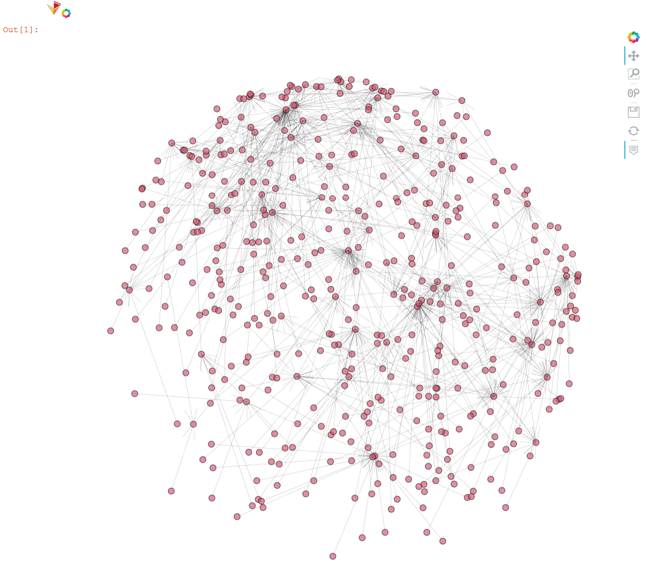
Final Large-scale Visualization with NetworkX
With these tests of the smaller graph complete, we are now ready to produce the final visualization of the full KBpedia graph. Though the modified code is presented below, and does run, we actually use a captured figure below the code listing to keep this page size manageable.
import pandas as pd
import holoviews as hv
import networkx as nx
from holoviews import opts
import hvplot.networkx as hvnx
#from bokeh.models import HoverTool

hv.extension('bokeh')

df = pd.read_csv('C:/1-PythonProjects/kbpedia/v300/extractions/data/graph_specs.csv')
Graphtype = nx.DiGraph()
G = nx.from_pandas_edgelist(df, edge_attr='weight', create_using=Graphtype)
print('Graph construction complete.')

pos = nx.spring_layout(G, k=0.4, iterations=70)

hvnx.draw(G, pos, node_color='#FCCC25', alpha=0.65).opts(node_size=5, width=950, height=950,
                           edge_line_width=0.1)

#, tools=['hover'], inspection_policy='edges'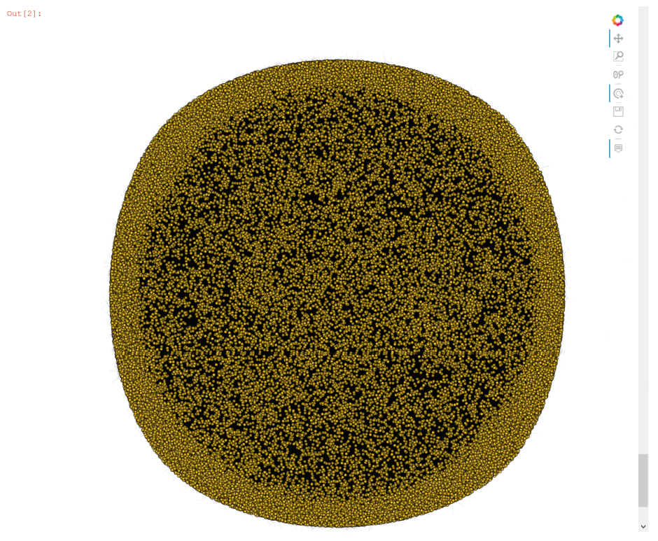
Other Graphing Options
I admit I am disappointed and frustrated with available Python options to capture the full scale of KBpedia. The pure Python options are unacceptably slow. Options that promise better performance and a wider choice of layouts and visualizations are difficult, if not impossible, to install on Windows. Of all of the options directly tested, none allowed me (at least with my limited Python skill level) to vary node colors or node sizes by in-degrees.
On the other hand, we began to learn some of the robust NetworkX package and will have occasion to investigate it further in relation to network analysis (CWPK #61). Further, as a venerable package, NetworkX offers a wide spectrum of graph data formats that it can read and write. We can export our graph specifications to a number of forms that perhaps will provide better visualization choices. As examples, here are ways to specify two of NetworkX’s formats, both of which may be used as inputs to the Gephi package. (For more about Gephi and Cytoscape as options here, see the initial links at the beginning of this installment.)
import pandas as pd
import networkx as nx

df = pd.read_csv('C:/1-PythonProjects/kbpedia/v300/extractions/data/graph_specs.csv')
Graphtype = nx.DiGraph()
G = nx.from_pandas_edgelist(df, edge_attr='weight', create_using=Graphtype)

nx.write_gexf(G, 'C:/1-PythonProjects/kbpedia/v300/extractions/data/graph_specs.gexf')

print('Gephi file complete.')

nx.write_gml(G, 'C:/1-PythonProjects/kbpedia/v300/extractions/data/graph_specs.gml')

print('GML file complete.')
Additional Documentation
This section presents the significant amount of material reviewed in order to make the choices for use in this present CWPK installment.
First, it is possible to get online help for most options to be tested. For example:
hv.help(hvnx.draw)And, here are some links related to options investigated for this installment, some tested, some not:
NetworkX
- https://networkx.github.io/
- https://networkx.github.io/documentation/stable/tutorial.html (start here). Specific sub-topics of key relevance include:
- http://holoviews.org/user_guide/Network_Graphs.html
- https://docs.bokeh.org/en/latest/docs/user_guide/tools.html#hovertool
- https://networkx.github.io/documentation/stable/_downloads/networkx_reference.pdf (impressive 700+ pages in documentation).
These same references above are also provided for the ‘latest’ version.
graph-tool
- https://graph-tool.skewed.de/static/doc/index.html
- https://git.skewed.de/count0/graph-tool/-/wikis/installation-instructions
- http://ryancompton.net/2014/10/05/graph-tools-visualization-is-pretty-good/.
NetworKit
- https://networkit.github.io/
- https://github.com/networkit/networkit/blob/Dev/notebooks/User-Guide.ipynb (works in Notebook)
- https://stackoverflow.com/questions/tagged/networkit.
deepgraph
- https://deepgraph.readthedocs.io/en/latest/
- https://arxiv.org/pdf/1604.00971.pdf
- https://github.com/deepgraph/deepgraph.
nxviz
- visualization package for NetworkX
- https://github.com/ericmjl/nxviz
- https://nxviz.readthedocs.io/en/latest/
- https://nxviz.readthedocs.io/en/latest/usage.html
- Perhaps limited plot types.
Netwulf
- https://github.com/benmaier/netwulf/
- https://netwulf.readthedocs.io/en/latest/
- depends on NetworkX
- save as PDF
- appears to be d3-force layout only
- interactive styling and filtering.
igraph
- https://igraph.org/redirect.html
- https://igraph.org/2020/02/14/igraph-0.8.0-python.html
- https://github.com/igraph/python-igraph
- https://igraph.org/python/doc/tutorial/tutorial.html
- seems a bit more oriented to R.
SNAP
- http://snap.stanford.edu/
- https://snap.stanford.edu/snap/
- http://snap.stanford.edu/snappy/index.html.
pygraphistry
- https://github.com/graphistry/pygraphistry
- free API, then costs https://www.graphistry.com/.
ipycytoscape
- https://blog.jupyter.org/interactive-graph-visualization-in-jupyter-with-ipycytoscape-a8828a54ab63
- https://github.com/QuantStack/ipycytoscape/blob/master/examples/DataFrame%20interaction.ipynb
- too new, immature
- https://github.com/cytoscape/cytoscape-automation/blob/master/for-scripters/Python/advanced-cancer-networks-and-data.ipynb
- https://py2cytoscape.readthedocs.io/en/latest/ (py2cytocape depends on python-igraph).
*.ipynb file. It may take a bit of time for the interactive option to load.


