As I get near to releasing my site, I began asking colleagues to provide feedback. It was then that I learned that the site was not displaying well in Internet Explorer, and only slightly better in Opera. I typically do all of my development and Internet use with Mozilla (1.7.6 at present). This post shows what was wrong and what I’ve learned.
Examples of the Challenge
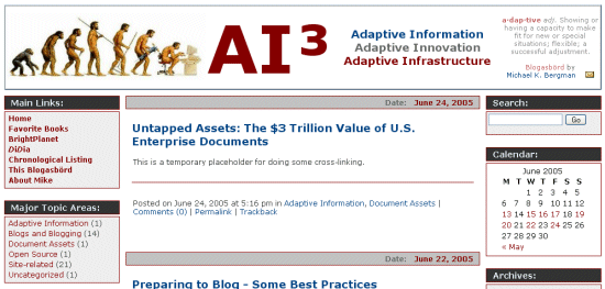
Depending on how the style sheet is written, you can have major problems with cross-browser display. For example, here is the screen shot as represented in Mozilla (Firefox displays similarly) (~45% reduced size) prior to my giving this issue attention:

Note the display is not too bad, since I develop using Mozilla.
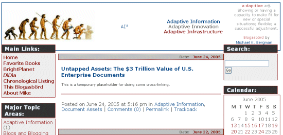
However, when I brought the same page up with Internet Explorer, suddenly everything was screwed up!!@$^&* Here is the same size screen shot of the same page in Internet Explorer:

Note that fonts are of greatly different sizes and the layout registry is messed up with overlaps, etc. How do we fix this stuff?
Some Cross-browser Analysis
Cascading style sheets (CSS) and browser support are of relative late vintage. Today, most modern browsers (Netspace past v. 4; IE past v. 5-6; Mozilla past v. 1.6; Firefox; Opera past v. 7; Safari past v. 1) have generally good conformance to standards, but there are some differences. Discrepancies with IE tend to be the greatest, though Microsoft has made strides in better compatibility. For browser comparisons, see further here.
Discrepancies tend to deal mostly with font sizing and treatment, tables and display, and various degrees or not for forgiving older HTML designs. To overcome these issues, users and experts tend to take one of three approaches (or combinations thereof) (a general, useful intro on style differences and browsers is provided by
Code Style):
- Very careful attention to cross-browser CSS syntax;
- Browser detections with swap outs of replacement styles in other CSS with the browser-specific syntax (for arguments supporting this approach using @import, see Stylegala or Avoiding Hacks. A more definitive treatment of different style sheets for swapping is provided by the Site Wizard;
- CSS “hacks” or filters that use browser tricks or quirks to set branching and choice conditions for different browsers. The definitive expert in this field and the discovery and developer of many of these techniques is Tantek Celik, now at Technorati;
- And, avoidance of browser-incompatible CSS.
Since the latter option eliminates too many options, I will not discuss it further.
In general, because browsers are constantly upgrading, experts recommend NOT making style adjustments within actual Web pages. Use of external style sheets enable global changes and quicker, more consolidated updates and changes.
I am by no means a CSS expert, and, like previous posts, there is a dearth of central information on these topics anyway. However, I did discover that the biggest incompatibiily I had for my own site were for font treatment between IE and the Gecko (Mozilla/Firefox) browsers (tables and padding were a big problem prior to IE v. 6 as well ).
Font Treatment
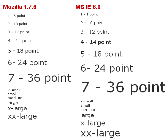
Text for the screen is sized with CSS using either pixels, ems, percentages, size numbers or keywords. Though pixels appears precise, IE does not handle re-sizing well with it. em is a precise measure that has fewer issues. Different browsers use diffierent sizing conventions for keywords (such as small, medium and large). This example shows that both keywords and size numbers are not handled equivalently by “modern” browsers:

The main problem shown in the screen captures at the top of this post is a mismatch in font sizes between Mozilla and IE; most of the layout problems cascade from these font size differences. My investigations suggest there are two main reasons for this:
- First, many recommend specifying the font-size attribute as a percent value because it maintains the differences users set within their own browsers. Percent values are OK in elements that are inherited, but if used for the base font definition in a style sheet, (p and body, for example), this exacerbates the inherent differences in the default font sizes used by browsers. IE 6, for example, uses a different default font size than Mozilla 1.7 (see above). If you instead set p and body as, say, 12 px, that equalizes the starting points and later percent differences from that baseline will be adequately reflected.
- Second, there appears to be greater discrepancy in how id and class are handled. To be safe, I have moved to embed style or heading differences where fonts are involved from the normal baseline by enclosing them within div tags.
Finally, for a nice tutorial on fonts and CSS, I encourage you to see the 2003 one by Owen Briggs at the Noodle Incident.
Author’s Note: I actually decided to commit to a blog on April 27, 2005, and began recording soon thereafter my steps in doing so. Because of work demands and other delays, the actual site was not released until July 18, 2005. To give my ‘Prepare to Blog …’ postings a more contemporaneous feel, I arbitrarily changed posting dates on this series one month forward, which means some aspects of the actual blog were better developed than some of these earlier posts indicate. However, the sequence and the content remain unchanged. A re-factored complete guide will be posted at the conclusion of the ‘Prepare to Blog …’ series, targeted for release about August 18, 2005. mkb


I found one editorial error:
[Some Cross-browser Analysis
Cascading style sheets (CSS) and browser support are of relative late vintage.]
Change "relative" to "relatively".
And the link for "Technorati" generates a 404 error.
The general information is good.